


A Surprising History of Tissue Packaging
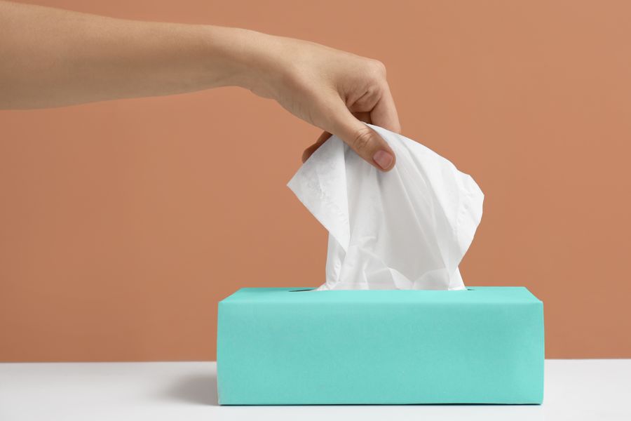
It sits on your nightstand, your desk, your car dashboard. You've never once read the instructions. But the tissue box is one of the most ingenious pieces of packaging ever designed; and its history is far stranger and richer than its modest cardboard exterior suggests.
Here is a small thought experiment. Imagine you are tasked with designing a container for 80–100 folded paper sheets. The container must dispense exactly one sheet at a time, must automatically present the next sheet after each use, must work with one hand, must work mid-sneeze, must never jam, must require no instructions, and must cost almost nothing to manufacture. Oh, and it also needs to look good on a bathroom shelf.
That is the tissue box. And it solves all of those problems so elegantly that most people have never once consciously thought about how it works. That invisibility, that seamless, frictionless functionality, is the hallmark of truly great design. And like all great design, it has a history worth knowing.
Before the Box Existed
When Kimberly-Clark launched Kleenex in 1924, there was no pop-up box. The product was sold in a flat, rectangular cardboard container, essentially a decorated tin-style box with a lift-off lid. You opened it like a box of chocolates, reached inside, and retrieved a tissue. The early Kleenex containers were designed to sit on a dressing table, marketed to women as a vanity accessory alongside their cold cream and perfume bottles.
The problem with this design was obvious: reaching into a flat box while simultaneously dealing with a cold, a sneeze, or a face full of makeup remover was awkward. You needed both hands. The box slid around. It wasn't ergonomic, but in 1924, "ergonomic" wasn't a word anyone used about tissue boxes.
Early Kleenex boxes were marketed as a vanity item, not a health product. The packaging was deliberately cosmetic; decorated, soft-coloured, designed to sit on a dressing table next to perfume. This framing would shape tissue box aesthetics for decades: the tissue box as domestic object, not medical supply.
The Deceptively Simple Pop-Up Mechanism
The interleaved pop-up mechanism; the design that makes tissue boxes actually work; was developed in the early 1930s and represents one of the most understated mechanical innovations in everyday product design. The principle is simple: each tissue is folded in a Z-shape around the edge of the tissue beneath it, so that when you pull one tissue out, it draws the next one partially through the slot, ready for the next use.
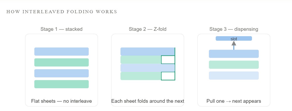
What makes this mechanism remarkable is that it works passively. There are no springs, no levers, no moving parts beyond the tissues themselves. The energy of pulling one tissue does all the work of presenting the next. It is, in engineering terms, a zero-maintenance dispensing system made entirely of folded paper. The patent for the interleaved pop-up method was filed in the early 1930s and became one of the foundational pieces of IP in the tissue industry.
Why the Oval Slot Is More Contested Than You'd Think
Look at the top of any tissue box and you'll see an oval or rectangular perforated slot. You've punched it open without thinking. But the shape, size, and placement of that slot is the subject of serious engineering consideration; and historically, significant patent competition.
Too large a slot and tissues fall back in, or come out in clumps. Too small and they tear on the way out, or the next tissue fails to feed through. The slot must be large enough to allow a folded tissue to pass, but have enough friction to hold the next tissue in place mid-pull. Early designs experimented with round holes, rectangular cuts, and various perforated tear-open configurations before the elongated oval with a reinforced edge became the de facto standard.
The cardboard around the slot is also engineered to resist deformation; a flat-topped box that collapses around the slot when you press it open is a failure state tissue manufacturers work hard to prevent. The subtle internal ribbing inside premium tissue boxes exists partly to maintain structural integrity at the dispensing point.
What the Second World War Did to Cardboard
Like so many design stories, the tissue box has a wartime chapter. During the Second World War, cardboard and paper materials were rationed in the United States and Britain as part of broader material conservation programmes. Tissue manufacturers were required to reduce packaging weight and complexity, which paradoxically drove innovation in box construction.
Manufacturers found ways to achieve the same structural rigidity with less cardboard; thinner walls braced with smarter folding geometry, more efficient blank shapes that minimised waste, and printing techniques that allowed decoration without extra layers. Several of these wartime economies became permanent features of tissue box construction because they turned out to be better than the pre-war approach, not just cheaper.
When the Tissue Box Became a Piece of Interior Design
By the 1950s, the tissue box had fully crossed from medical/hygiene product into domestic object, and with that came a new problem. The box was ugly. Or rather: it was fine in the bathroom cabinet, but once tissues became a bedside and living-room staple, the cardboard box clashed with people's home interiors.
The response came from two directions simultaneously. First, tissue manufacturers began investing seriously in box graphic design. The iconic Kleenex floral prints; pastel flowers, soft geometric patterns, seasonal motifs; date from this era. Kimberly-Clark and Scott Paper hired dedicated packaging designers and ran consumer research on colour preference by room type. AIGA archives contain mid-century tissue packaging as examples of mass-market graphic design that reached more homes than almost any gallery artwork.
Second; and this is the part that becomes genuinely strange; a parallel market emerged for tissue box covers. Decorative cases, made from ceramic, wicker, fabric, acrylic, wood, and eventually injection-moulded plastic, designed to hide the cardboard box entirely. These covers became a significant gift and homeware category. Entire craft traditions grew up around making them. Crocheted tissue box covers are a mainstay of mid-century American craft patterns. Ceramic tissue box holders appear in the archives of most major British pottery manufacturers from the 1960s onwards.
A Timeline of the Box
1924 - Kleenex launches in a flat-lid vanity box, designed to sit on a dressing table. No pop-up mechanism. Kimberly-Clark heritage records describe it as a cosmetics accessory.
Early 1930s - The interleaved Z-fold pop-up mechanism is developed and patented. The rectangular upright box with an oval dispensing slot becomes the standard form factor.
1939–1945 - Wartime paper rationing drives thinner, more efficient box construction. Rectangular geometry consolidates as the dominant form. Some wartime economy measures become permanent design improvements.
1950s - Tissue boxes become living-room and bedroom objects. Manufacturers commission dedicated packaging designers; floral and geometric print traditions begin. V&A collections hold mid-century packaging examples.
1960s–70s - The tissue box cover market explodes. Ceramic, wicker, fabric, and plastic covers become mainstream homeware. Craft patterns for crocheted covers proliferate in the US and UK.
1980s - The "boutique" tissue box emerges — premium brands compete on box aesthetics as much as product quality. Packaging design awards begin recognising tissue box work.
1990s–2000s - The cube box arrives as an alternative form factor, popularised by Kleenex. Cube boxes are structurally less efficient but visually balanced; a design-over-engineering trade-off that proved commercially successful.
2010s–present - Sustainable packaging pressure mounts. Manufacturers experiment with recycled and FSC-certified board, reduced-ink printing, and biodegradable coatings. The plastic film window; once a premium feature; becomes a liability.
How the Worse-Engineered Box Won
In the 1990s, Kleenex introduced the cube-shaped tissue box; and it became one of the most interesting case studies in form vs. function in consumer packaging. The cube is, structurally, a worse box than the standard rectangular upright. It holds fewer tissues for its footprint, is less efficient to stack and ship, and the top-facing oval slot makes one-handed extraction slightly more awkward than a front-facing slot on an upright box.
None of that mattered. The cube looked better; more balanced on a surface, less like a commodity product, more like a considered object. It photographed well. It sat well on a desk. It felt premium in a way that the rectangular box, however functionally superior, simply didn't. Packaging industry analysis from the period noted that the cube commanded higher shelf prices with no meaningful change in the product inside.
The cube box is now one of the two dominant tissue box formats globally, despite being the less rational choice. It is, in other words, a perfect example of the principle that in consumer goods, perception of quality frequently outperforms measurable quality.
The People Who Collect Vintage Tissue Boxes
Vintage tissue boxes are, genuinely, a collecting category. Mid-century Kleenex and Scotties boxes in original condition; particularly those with intact graphics from the 1950s and 60s; appear regularly on eBay and Etsy, and occasionally at mid-century design fairs. The graphics from this period are considered legitimate examples of mid-century American graphic design, and institutions including the Museum of Arts and Design in New York hold packaging design archives that include tissue box examples.
The Japanese market took tissue box design in a particularly distinctive direction. In Japan, where tissue boxes are known as tisshu bokkusu and are ubiquitous across homes, offices, and cars, packaging design became a significant competitive differentiator. Japanese tissue boxes have historically featured more elaborate graphics, seasonal series, collaboration with illustrators, and limited-edition designs; a reflection of Japan's broader packaging design culture, which treats everyday containers with an aesthetic seriousness rare elsewhere.
In Japan, tissue box packaging became so culturally significant that brands like Nepia and Elleair routinely release seasonal and limited-edition box designs. Collaboration with manga artists, photographers, and textile designers on tissue box graphics is not unusual. The box itself; not just the product; is considered part of the purchase decision.
What Happens to the Box Next
The tissue box today faces pressure from two directions. From retailers, there is constant demand to reduce packaging cost and weight. From consumers and regulators, there is mounting scrutiny on paper sourcing, recyclability, and the plastic components that some premium boxes include; the plastic film window that lets you see the tissues inside, and the plastic reinforcement ring around some dispensing slots.
Several manufacturers have moved to fully plastic-free boxes ahead of regulatory requirements. The FSC certification mark; indicating wood from responsibly managed forests; is now a near-universal feature on premium tissue packaging in Europe, following sustained pressure from organisations like the WWF. Some brands have experimented with packaging made from recycled tissue cores as an alternative board source.
What hasn't changed is the fundamental architecture: the rectangular box, the oval slot, the interleaved Z-fold, the one-at-a-time dispensing. That design has been stable for nearly a century, which in consumer packaging terms is a remarkable record. The box that sits on your desk today would be instantly recognisable to someone from 1935; and would work the same way. That kind of longevity is rare, and it's earned.